LAB.
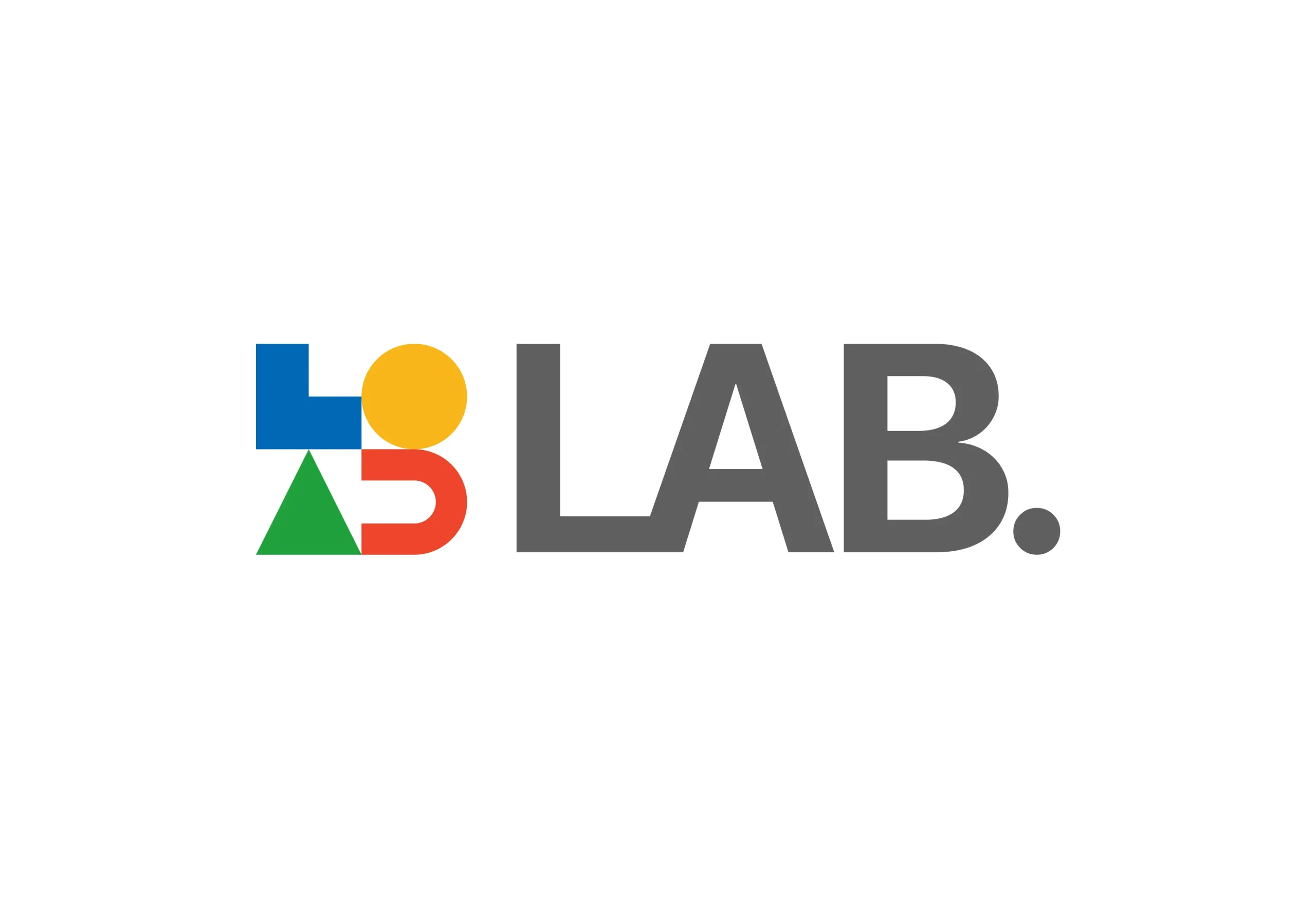
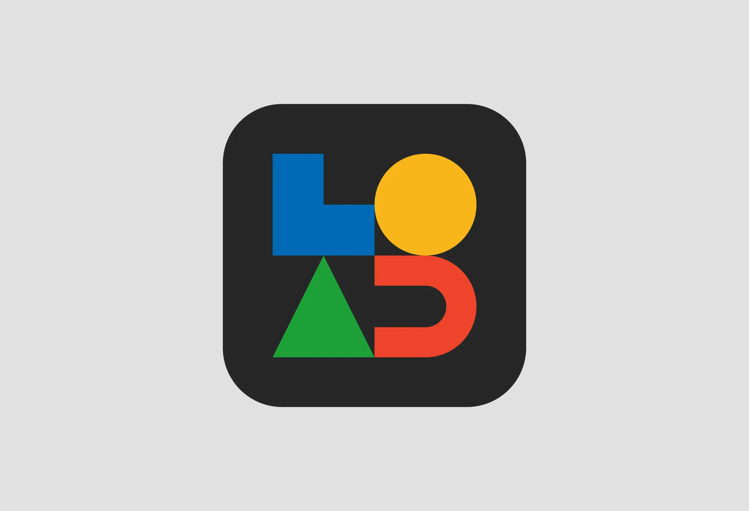
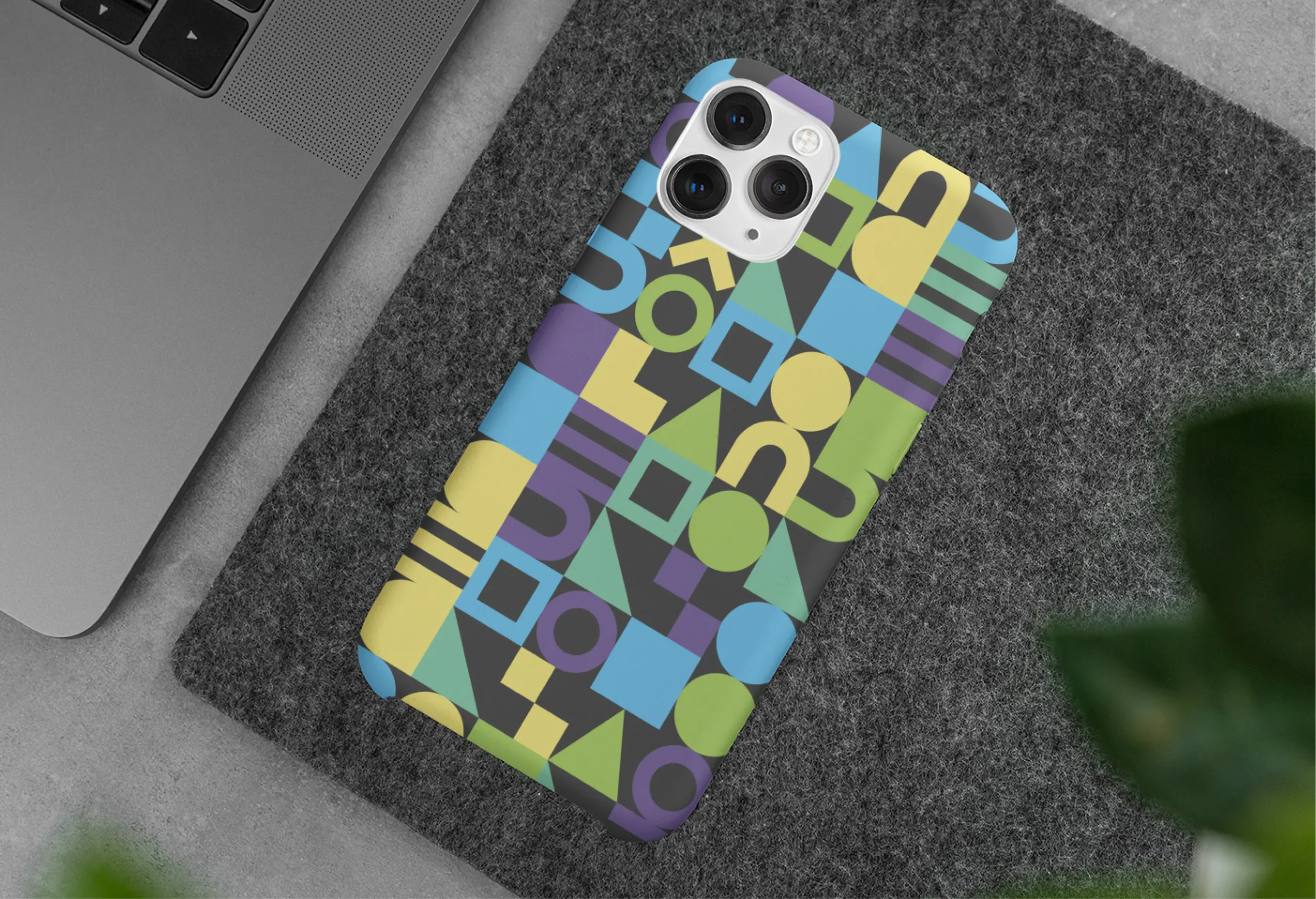
金田個人の実験場である「LAB.」のアイデンティティは、一見すると無機質な4つの幾何学図形によって構成されています。これらは、研究室の名である「L」「A」「B」の文字を象る最小単位の要素でありながら、そこに固定された正解はありません。
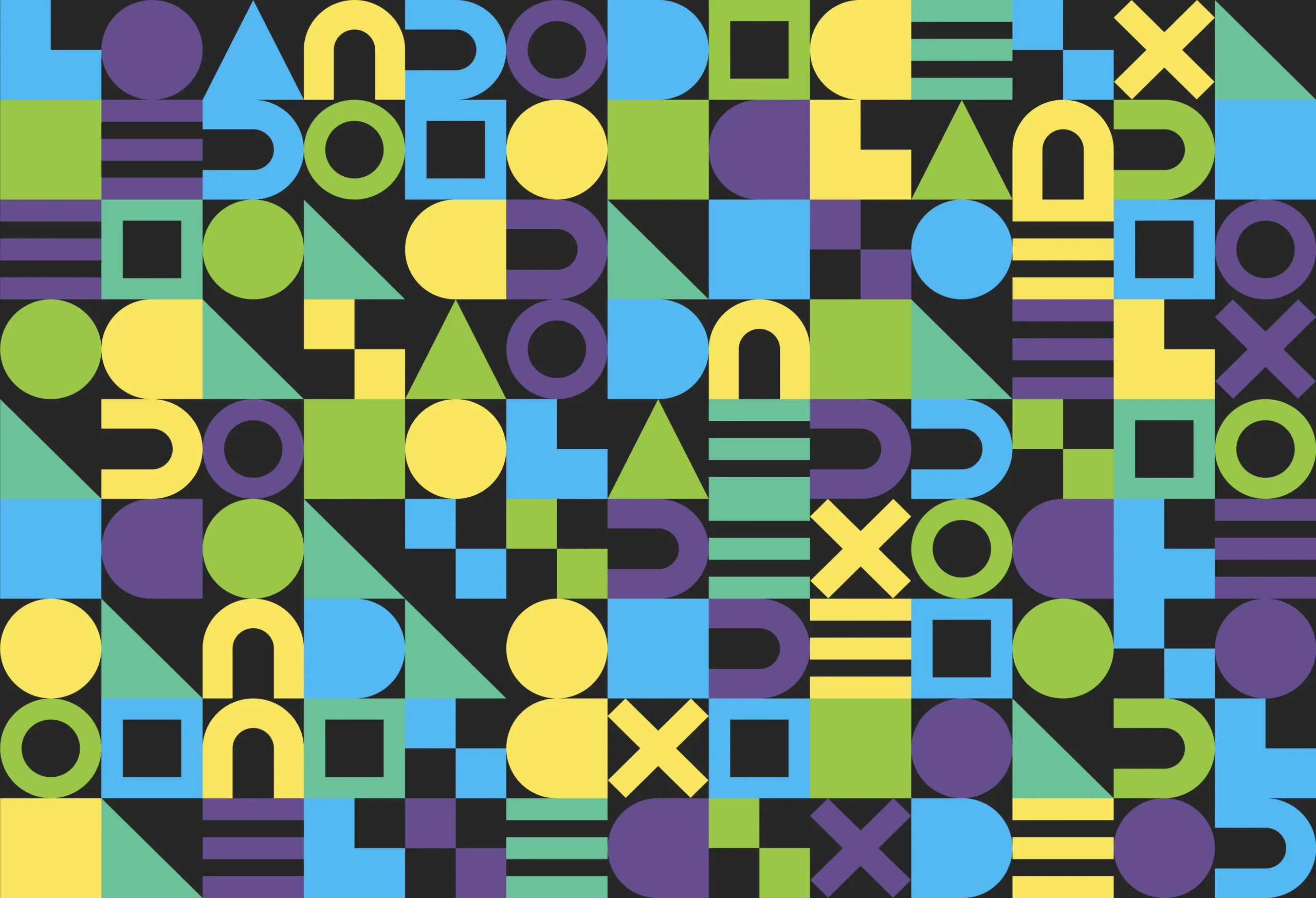
このロゴはAIのアルゴリズムによって絶えず組み合わされ、その形状と配色を流動的に変化させ続けます。ある時は秩序正しく、ある時は混沌とした表情を見せるその予測不能な姿。それは、失敗を恐れずに仮説と検証を繰り返し、試行錯誤を重ねる私たちの日常そのものを象徴しています。
常に未完成であり、常に新しい。「LAB.」のロゴが刻々と変わり続けるように、私たちもまた、遊び心を持って未知の領域へ挑み続けます。この終わりのない実験精神こそが、次なるデザインを生み出すクリエイティビティの源泉なのです。
このロゴはAIのアルゴリズムによって絶えず組み合わされ、その形状と配色を流動的に変化させ続けます。ある時は秩序正しく、ある時は混沌とした表情を見せるその予測不能な姿。それは、失敗を恐れずに仮説と検証を繰り返し、試行錯誤を重ねる私たちの日常そのものを象徴しています。
常に未完成であり、常に新しい。「LAB.」のロゴが刻々と変わり続けるように、私たちもまた、遊び心を持って未知の領域へ挑み続けます。この終わりのない実験精神こそが、次なるデザインを生み出すクリエイティビティの源泉なのです。
LAB.
The visual identity of "LAB.", Kaneda’s personal laboratory, comprises four seemingly inorganic geometric shapes. While these minimal elements form the letters "L", "A", and "B", they adhere to no fixed, definitive form.
Driven by AI algorithms, the logo is constantly recombined, fluidly shifting its shape and color scheme. Its unpredictable appearance—at times orderly, at others chaotic—symbolizes our daily reality: repeating trial and error, and testing hypotheses without fear of failure.
Always unfinished, always new. Just as the "LAB." logo changes moment by moment, we continue to challenge unknown realms with a sense of playfulness. This endless spirit of experimentation is the very source of creativity that generates our next design.