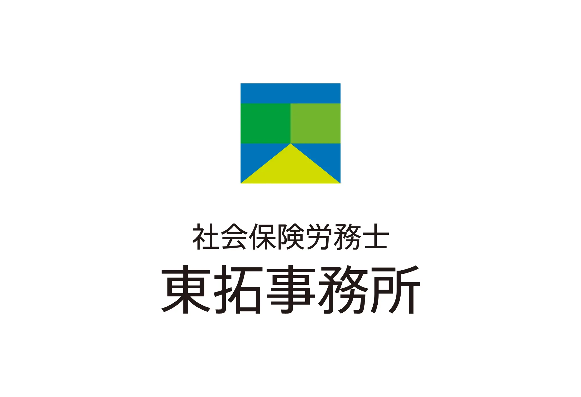
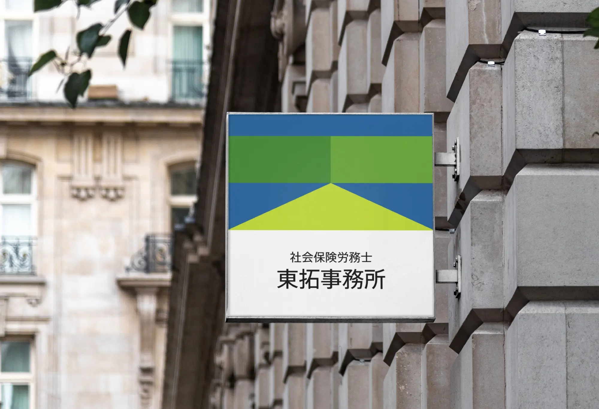
社会保険労務士 東拓事務所
Taku AZUMA(office)の頭文字「T」と「A」がモチーフになっており、漢字の「東」も合わせてデザインされたロゴマークです。
シンプルな図形の組み合わせで構成されており、信頼と安定、安心感があります。
また、三角形は道であり、社会保険労務士として顧客企業の未来を「拓」く一翼を担う覚悟をも表現しています。
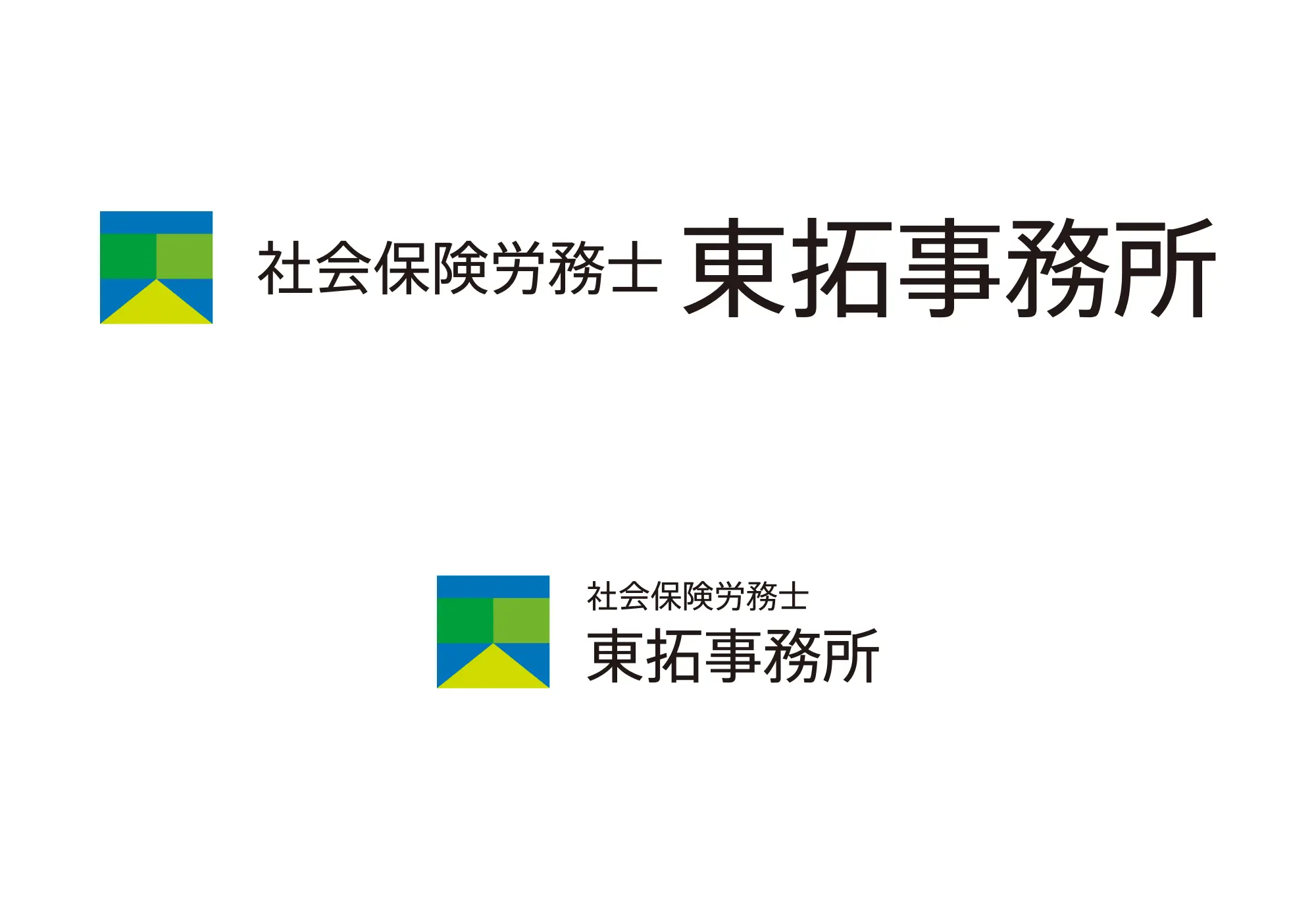
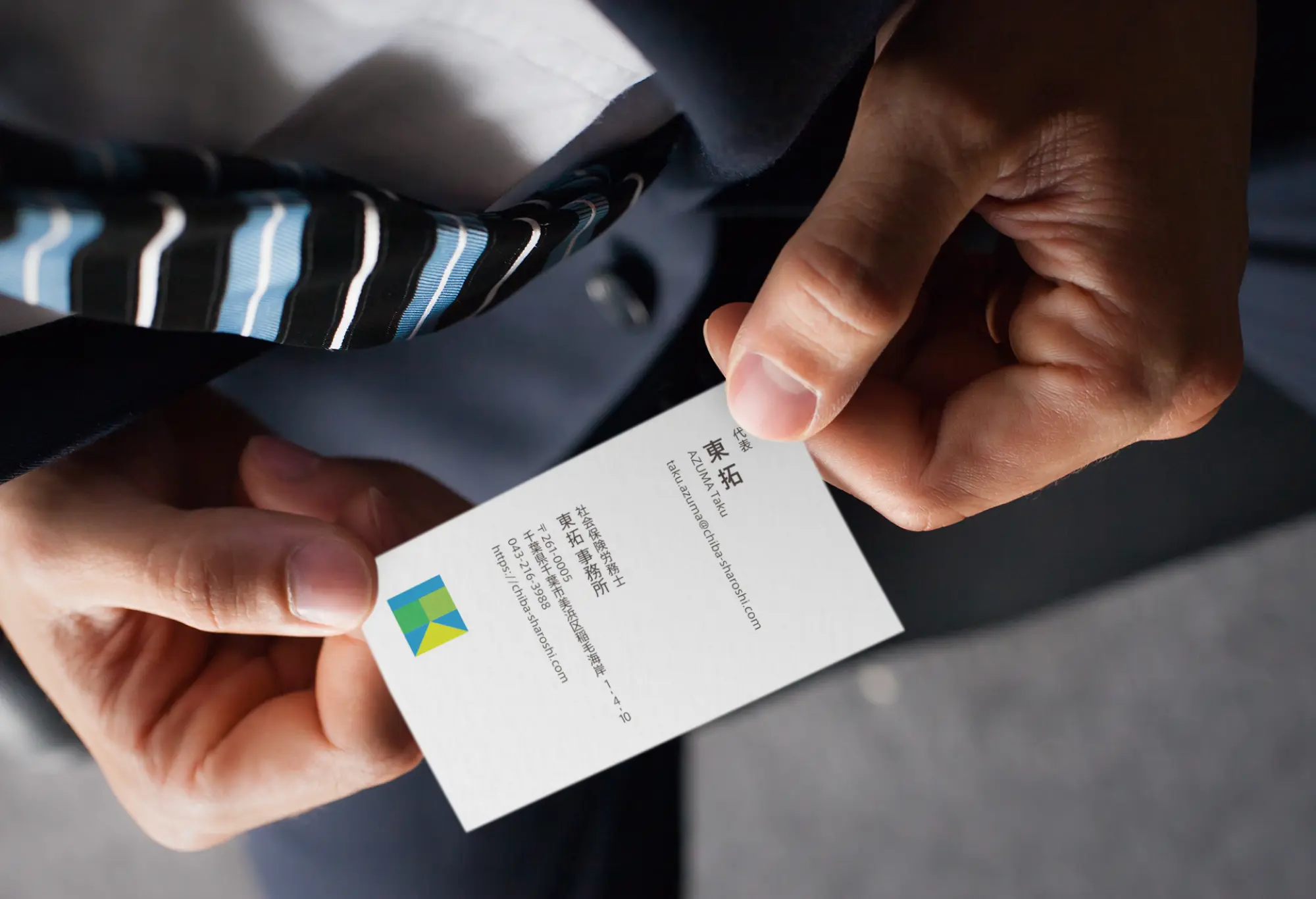
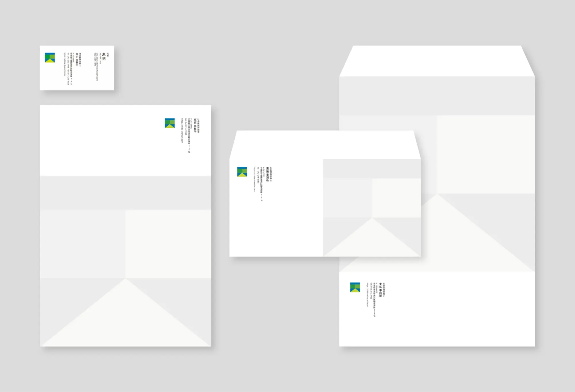
ロゴだけでなく、名刺、封筒などステーショナリー類のデザインも担当いたしました。
シンプルな図形の組み合わせで構成されており、信頼と安定、安心感があります。
また、三角形は道であり、社会保険労務士として顧客企業の未来を「拓」く一翼を担う覚悟をも表現しています。
ロゴだけでなく、名刺、封筒などステーショナリー類のデザインも担当いたしました。
TakuAZUMA Office
This logo was designed using the initials of Taku AZUMA (office), "T" and "A," as motifs, combined with the kanji "東."
Made from a combination of simple shapes, it gives off a sense of trustworthiness, stability, and security.
Additionally, the triangle forms a road, symbolizing determination to play a part in "opening up" the path to the future for client companies as their social insurance and labor consultant.
Made from a combination of simple shapes, it gives off a sense of trustworthiness, stability, and security.
Additionally, the triangle forms a road, symbolizing determination to play a part in "opening up" the path to the future for client companies as their social insurance and labor consultant.