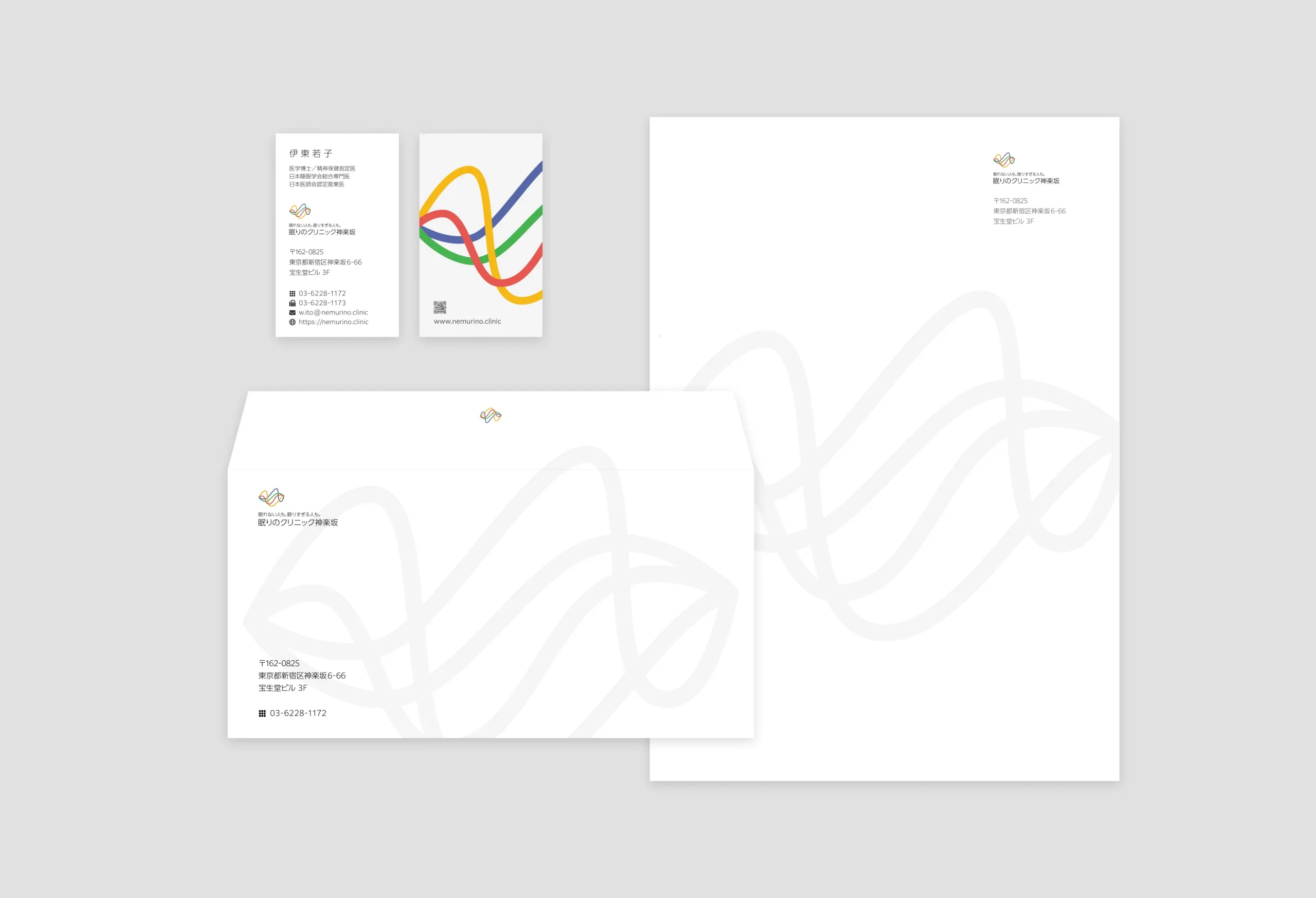
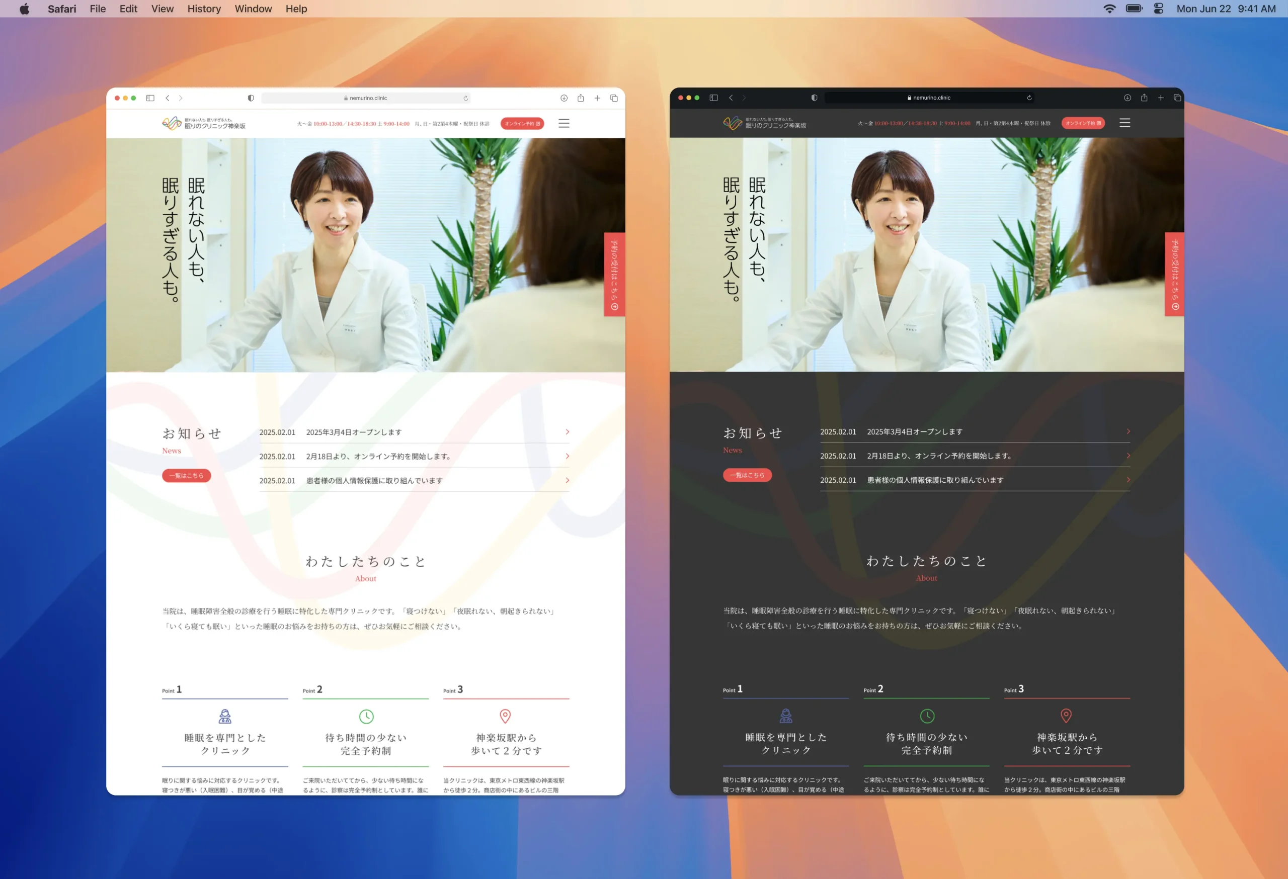
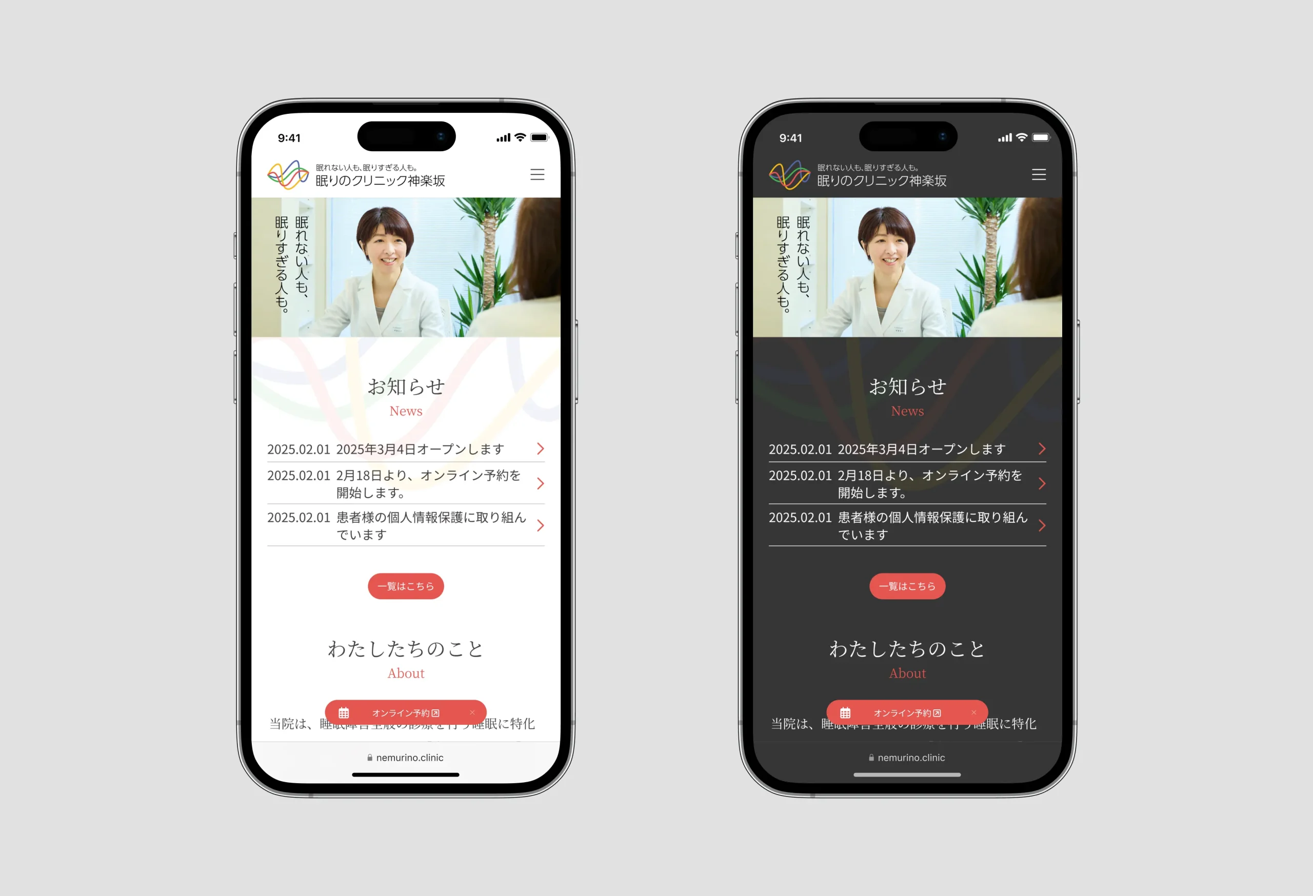
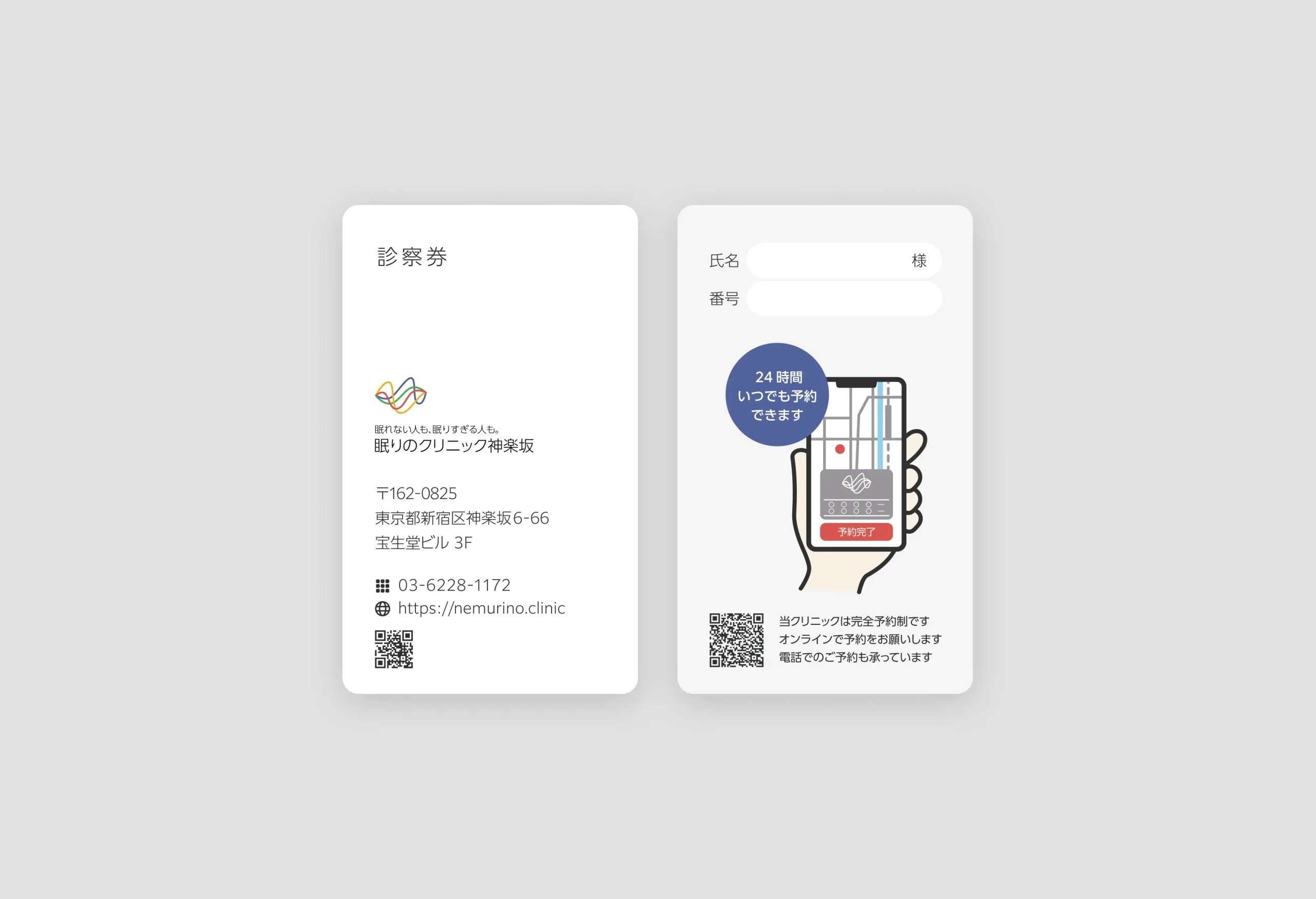
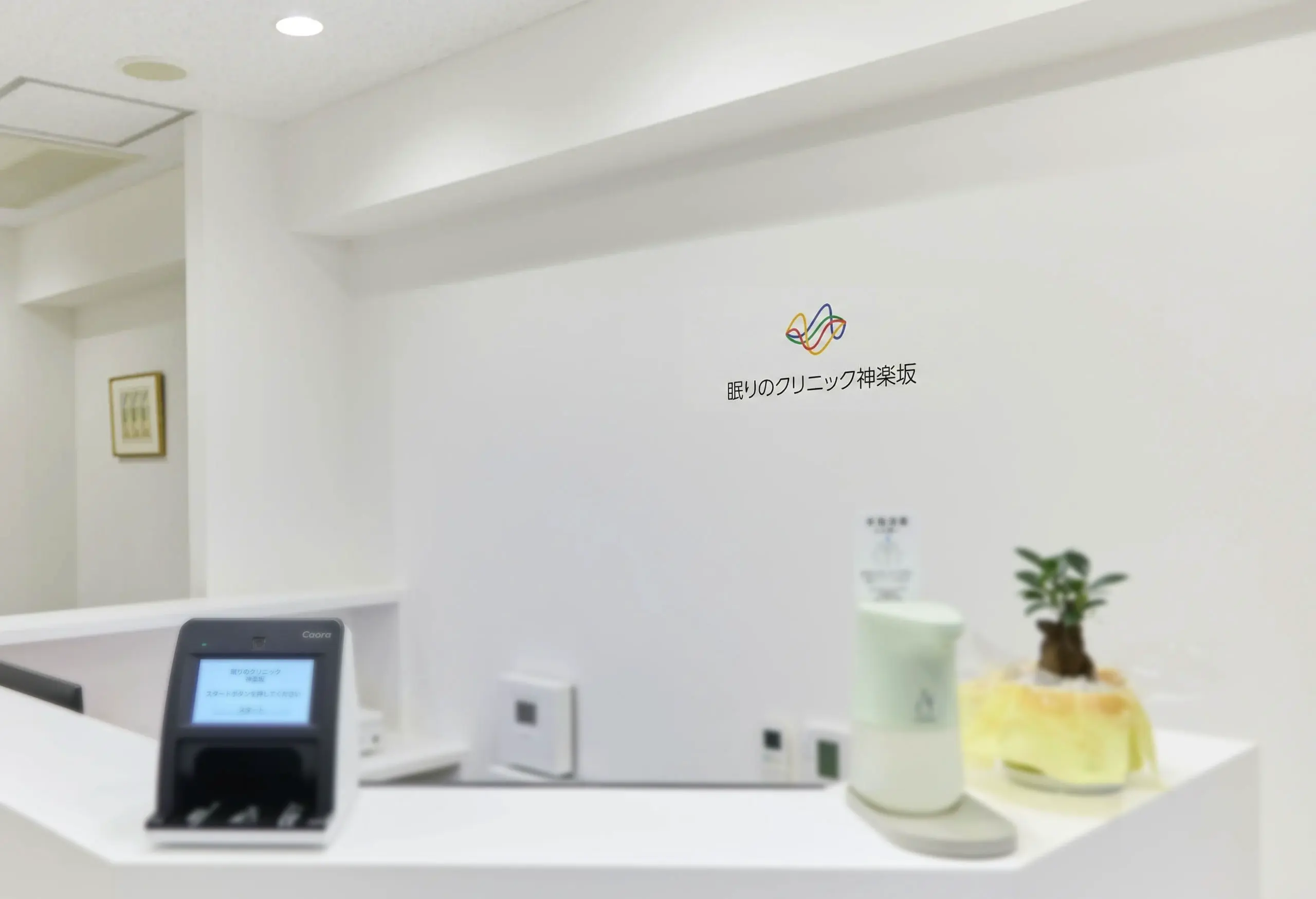
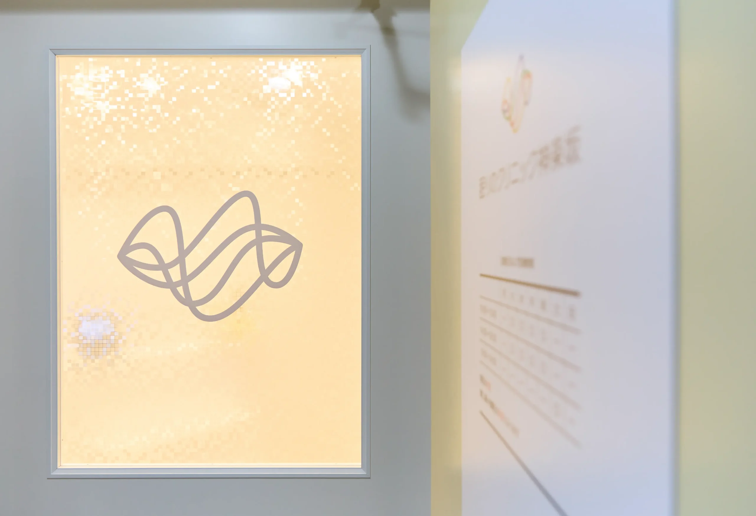
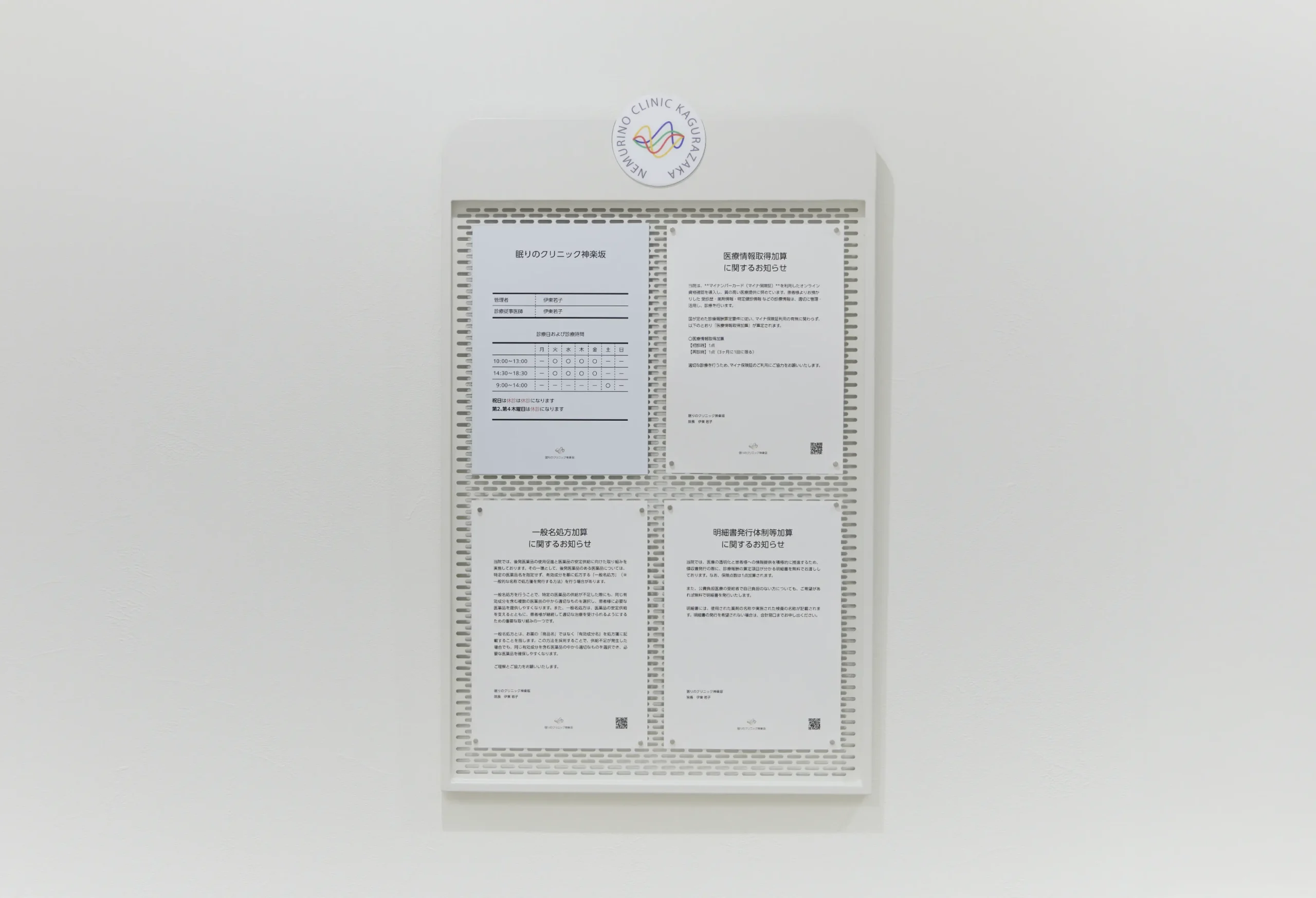
眠りのクリニック神楽坂
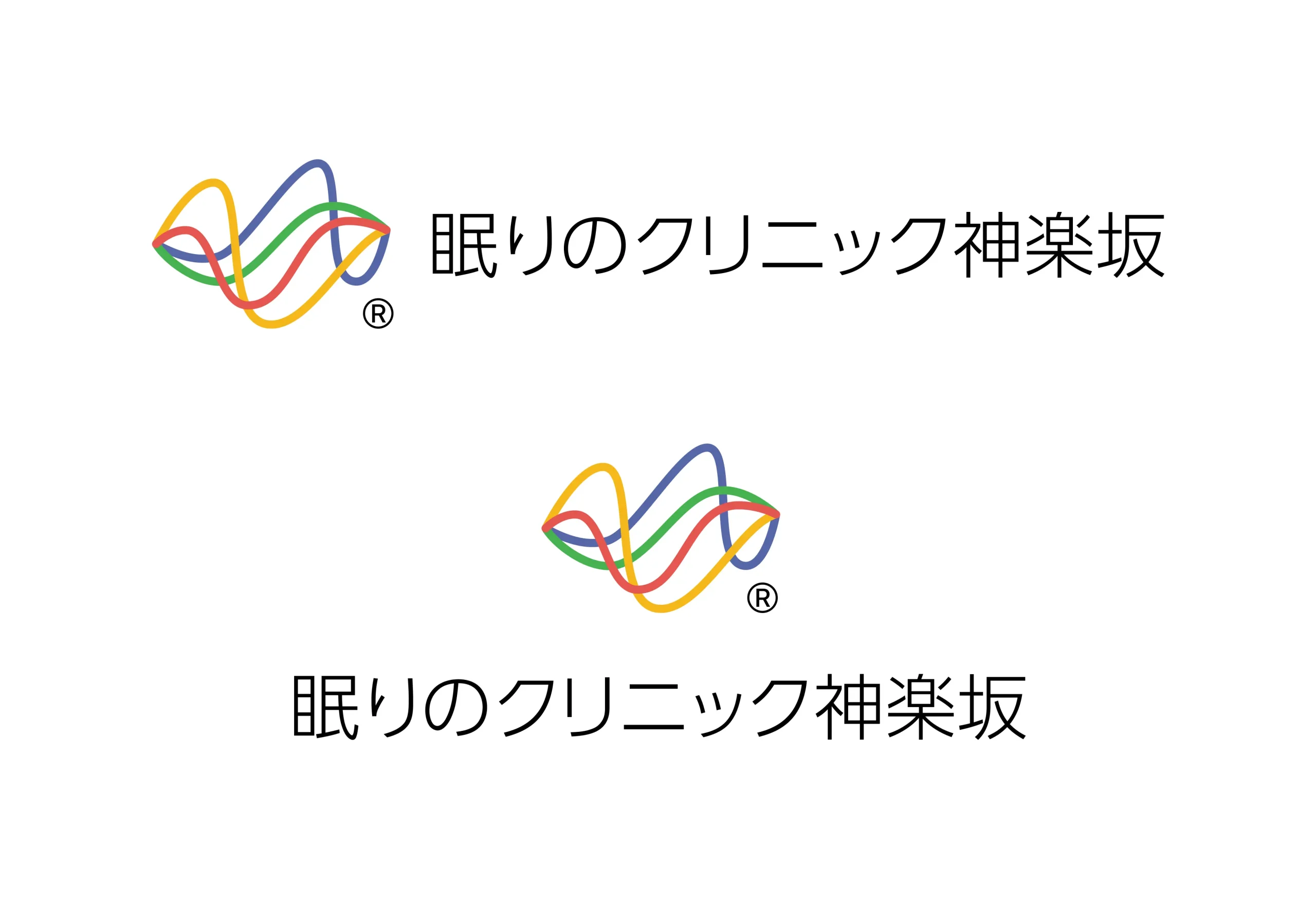
このロゴは、クリニック名「ねむりの」の頭文字「N」と、睡眠サイクルを象徴する波形グラフを組み合わせたデザインです。カラフルな波形は、睡眠中の脳波の変化を視覚化しており、レム睡眠やノンレム睡眠といった異なる睡眠段階を表現しています。また、波形の多様性は、人々の睡眠パターンが個別性に富んでいることを示し、クリニックが患者一人ひとりに合わせたカスタマイズケアを提供する姿勢を象徴しています。
さらに、このロゴには、睡眠が単なる休息ではなく、身体と精神の健康に不可欠な活動的プロセスであるという理念が込められています。ノンレム睡眠では脳の休息や身体の修復が行われ、レム睡眠では記憶や感情の整理が進むなど、科学的根拠に基づいた治療への信頼感を与えるデザインです。
このロゴは、クリニックの理念や治療方針を表現する重要な要素であり、多様性と個別性を重視する姿勢を強調しています。その視覚的な美しさと意味深さは、患者に安心感を与え、クリニック全体のブランドイメージ向上にも寄与しています。
さらに、このロゴには、睡眠が単なる休息ではなく、身体と精神の健康に不可欠な活動的プロセスであるという理念が込められています。ノンレム睡眠では脳の休息や身体の修復が行われ、レム睡眠では記憶や感情の整理が進むなど、科学的根拠に基づいた治療への信頼感を与えるデザインです。
このロゴは、クリニックの理念や治療方針を表現する重要な要素であり、多様性と個別性を重視する姿勢を強調しています。その視覚的な美しさと意味深さは、患者に安心感を与え、クリニック全体のブランドイメージ向上にも寄与しています。
眠りのクリニック神楽坂
This logo combines the initial “N” of the clinic name “Nemurino” with a waveform graph symbolizing the sleep cycle. The colorful waveform visualizes changes in brainwaves during sleep, representing different sleep stages such as REM and non-REM sleep. Additionally, the diversity of the waveform highlights the individuality of people’s sleep patterns, symbolizing the clinic’s commitment to providing customized care tailored to each patient.
Furthermore, the logo embodies the philosophy that sleep is not merely rest but an essential, active process for physical and mental health. Non-REM sleep facilitates brain rest and physical repair, while REM sleep aids in memory and emotional processing. This design instills trust in treatments grounded in scientific evidence.
The logo is a key element reflecting the clinic’s philosophy and treatment approach, emphasizing diversity and individuality. Its visual appeal and profound meaning provide reassurance to patients and contribute to enhancing the clinic’s overall brand image.