株式会社シー・シー・ダブル
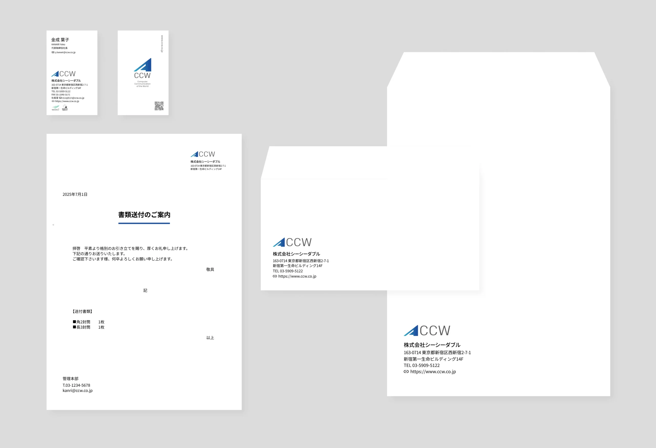
プロジェクトではまずブランドロゴの整理やマニュアル化を行い、視覚的な基盤を整備したうえで、Web全体のデザイン構築に取り組みました。
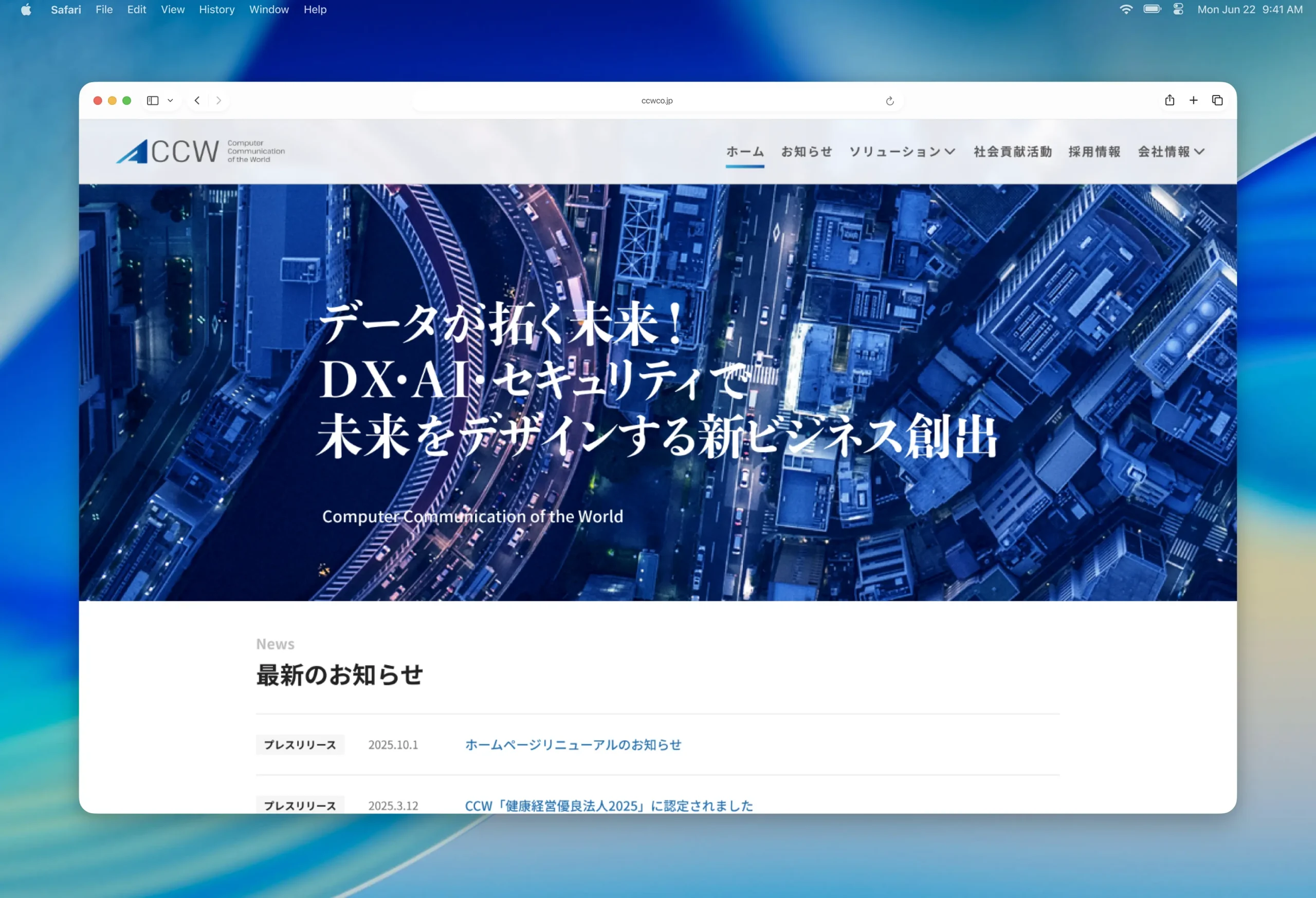
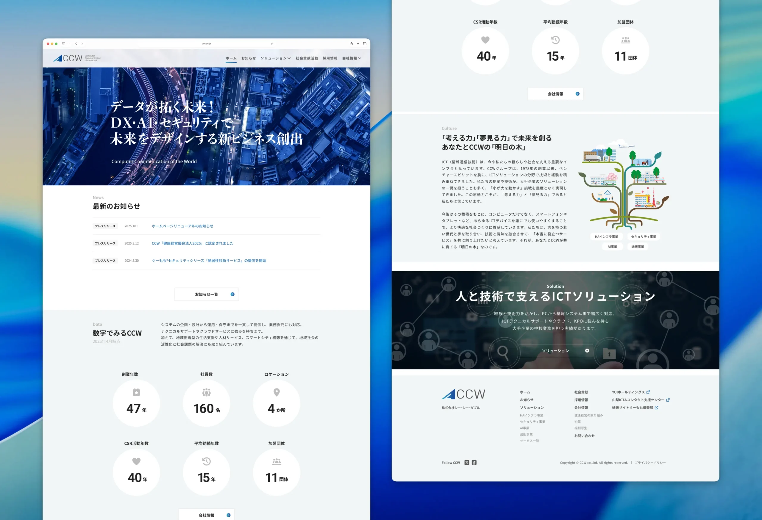
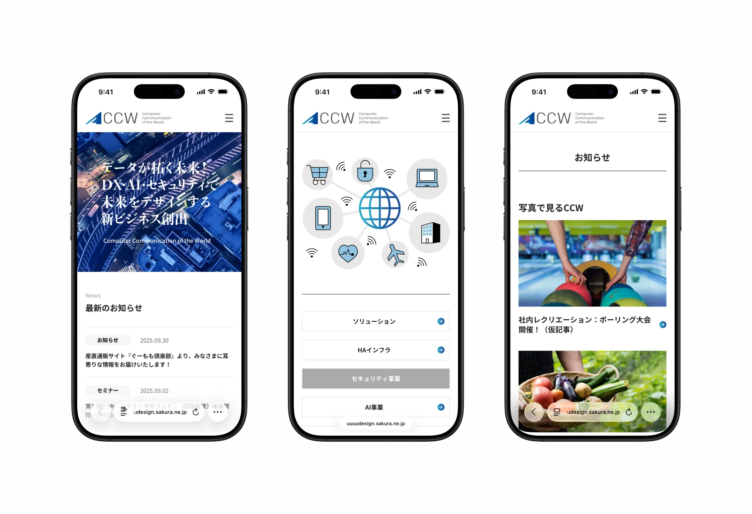
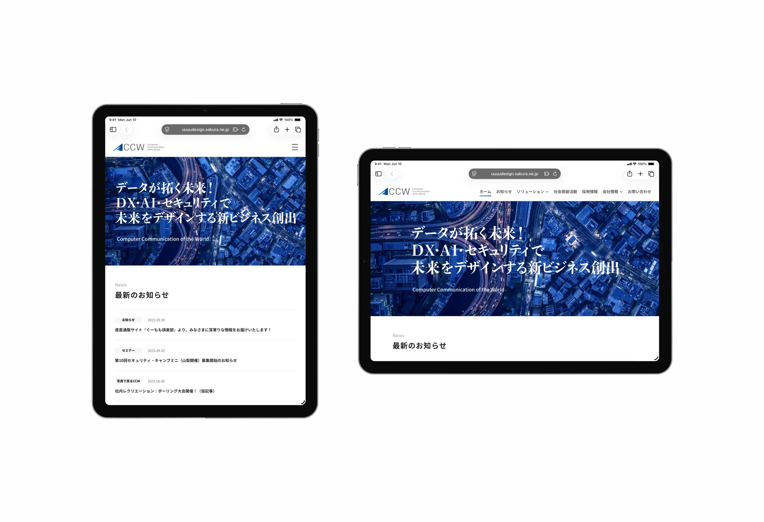
情報設計の段階では、既存コンテンツを見直し、利用者が必要な情報に最短でアクセスできるようシンプルで明快なナビゲーションを再構築。
デザイン面では、ブランドカラーである「CCWブルー」をポイントとして配置することで、全体に統一感を持たせつつ印象的なアクセントを加えました。余白を活かしたレイアウトや視線誘導を意識した構成により、誠実さや信頼感を視覚的に伝えると同時に、ユーザーにストレスのない閲覧体験を提供しています。
単なる見た目の刷新にとどまらず、ユーザー体験を起点としたデザインへ進化させることで、株式会社シー・シー・ダブル様が持つブランドイメージをより鮮明に表現するWebサイトに仕上げました。
CCW co.,ltd.
We had the privilege of overseeing the full redesign of the corporate website for CCW Inc.
The project began with a refinement of the brand logo and the creation of usage guidelines, establishing a strong visual foundation before moving on to the overall website design.
During the information architecture phase, we reorganized existing content to ensure users could reach essential information quickly and intuitively, supported by a clear and streamlined navigation structure.
From a design perspective, the brand’s signature “CCW Blue” was applied strategically as an accent, creating visual consistency while providing a distinctive highlight throughout the site. The use of generous white space and layouts designed to guide the user’s eye not only emphasize the company’s sense of integrity and reliability but also deliver a smooth, stress-free browsing experience.
More than a visual refresh, this redesign evolved the website into a design-driven platform that enhances user experience while clearly communicating CCW Inc.’s brand values.