愛知淑徳大学 建築学部
このロゴは、「Aichi」と「Architecture」の頭文字である「A」を構成する3つの線を平面的に配置し、それぞれが異なる方向に伸びることで、個々の個性や進む道の多様性を立体的に表現しています。
各線が軌道を描きながら中心点から発するデザインは、自らの道を選びつつ、違いを認め合い共存する姿を象徴しています。また、立体的な要素を加えることで、空間に深みを与え、動きや変化を感じさせるこのデザインは、多様性が調和し一体となる様子を表現しています。
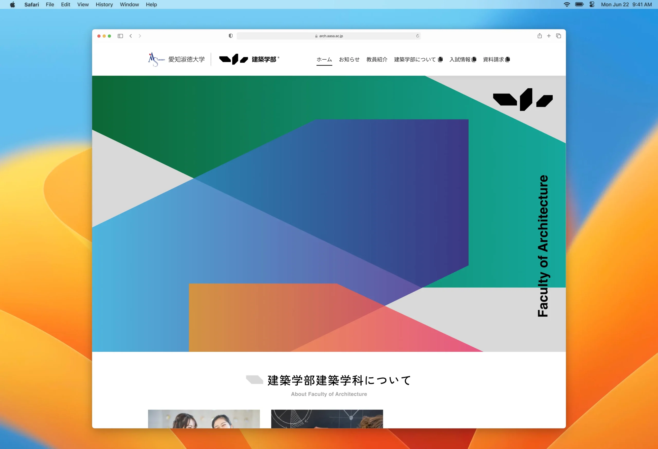
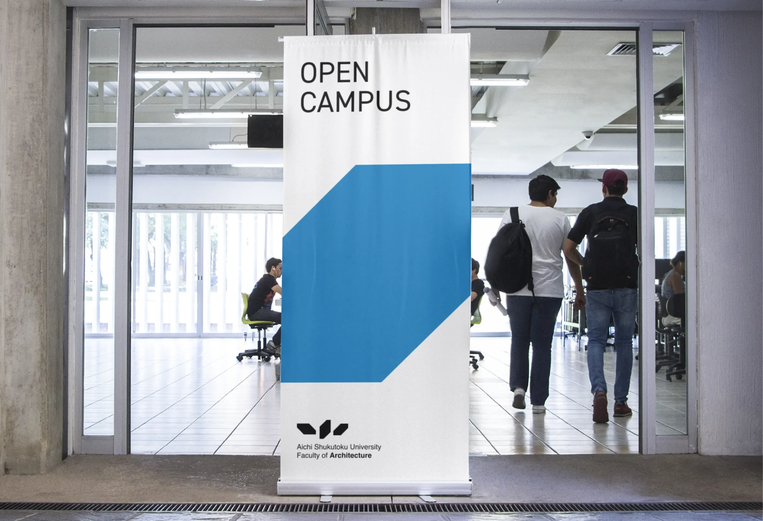
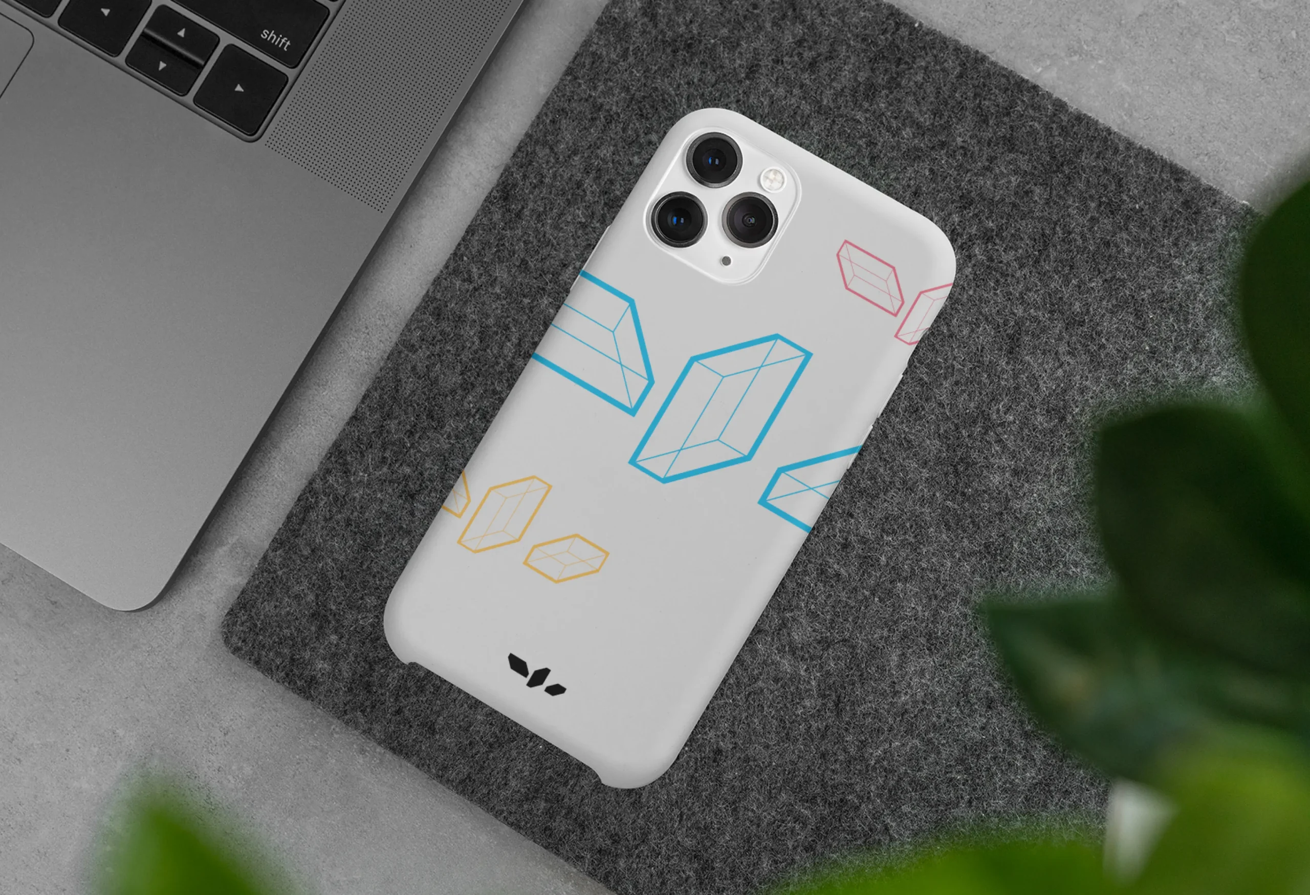
ロゴを中心にWebや各アイテムのデザインを想定した、建築学部全体のブランディング展開を担当させていただきました。
各線が軌道を描きながら中心点から発するデザインは、自らの道を選びつつ、違いを認め合い共存する姿を象徴しています。また、立体的な要素を加えることで、空間に深みを与え、動きや変化を感じさせるこのデザインは、多様性が調和し一体となる様子を表現しています。
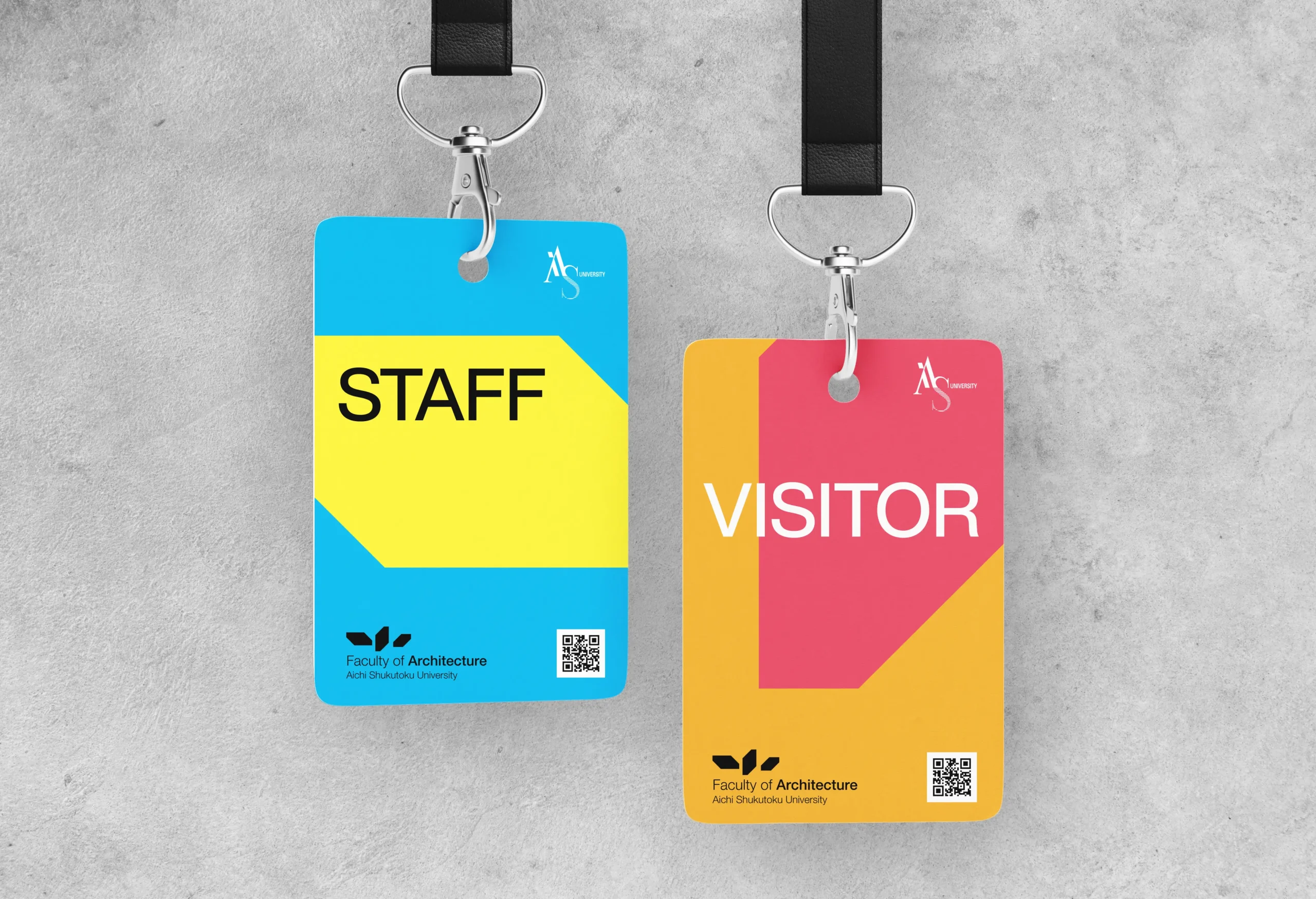
ロゴを中心にWebや各アイテムのデザインを想定した、建築学部全体のブランディング展開を担当させていただきました。
ASU Faculty of Architecture
This logo is made up of three lines, representing the initial "A" of "Aichi" and "Architecture," on a flat plane. Each line extends in a different direction, symbolizing individual uniqueness and the variety of paths in a three-dimensional manner. The design, where each line radiates from a central point while tracing its trajectory, symbolizes choosing one's own path while acknowledging and coexisting with differences. The addition of three-dimensional elements adds depth to the space and conveys a sense of movement and change, representing harmony and unity in diversity.
We handled the overall branding for the Department of Architecture, envisioning the design of the website and various items around the logo.
We handled the overall branding for the Department of Architecture, envisioning the design of the website and various items around the logo.